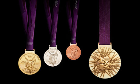
London 2012: Olympic gold medals glitter in public for the first time
The weighty discs that will adorn the exultant necks of thousands of athletes in a year’s time were allowed to glitter in public for the first time .
As the organisers were keen to point out, these are no mere baubles: rather, they are deeply symbolic prizes that would surely have buckled under the weight of all the metaphor that was being thrust upon them were it not for their sturdy metallic construction.
To untrained eyes, the medals all have a picture of the Greek goddess of victory, Nike, on the front, and the London 2012 logo superimposed on lots of straight lines and one wiggly one on the back.
Not so, say the organisers. “The core emblem is an architectural expression, a metaphor for the modern city, or … a geological metaphor as a tough crystalline growth which is deliberately jewel- like,” according to the PR blurb. The grid of lines, meanwhile, “brings both a pulling together and sense of outreach on the design – an image of radiating energy that represents the athletes’ achievements and effort”.
It was left to David Watkins, the British artist who designed the medal, to explain his creation to the press. He revealed that “circularity” had given him his starting point and confirmed that the wavy line was the “iconic” Thames, which had been included to bring “the whole thing to life like a banner fluttering to the wind”.
But what light could he shed on the square that encloses the jagged 2012 logo? “It’s an almost metaphysical square,” he explained to a suddenly rather quiet room.
Fortunately, the man from the Royal Mint — which will manufacture more than 2,100 medals at its headquarters in Llantrisant, south Wales — was on hand to explain the aesthetics and functionality of the box each prize will come in.
“It will protect and cushion the medal,” he said.Some branding experts were not won over by the new design. Gion-Men Kruegel-Hanna, executive creative director of Interbrand in London, said the medals were rather more conservative than might have been expected.
“What the original London 2012 identity – hate it or love it – initially tried to achieve manifests itself in a very much toned-down appearance from the torch design to the medals,” he said. “All nicely designed, but we are missing the ‘legacy’ aspect a bit, which clearly manifests itself in the Olympic site with its architectural icons.”
Still, as the Olympic gold medal-winning former triple jumper Jonathan Edwards suggested, athletes aren’t bothered about the design, so long as they win one. “There are a lot of stories of shenanigans that go on in the athletes’ village,” he confided. “But I want you to know that the only thing I slept with was my medal.”
All the glitters
The ore for the medals comes from London 2012 sponsor Rio Tinto’s Utah Copper Mine in Salt Lake City, US, and Oyu Tolgoi project in Mongolia. The medals will go into production later this year at the Royal Mint’s headquarters in Llantrisant, south Wales.
1 The front of each medal carries the same imagery as at every summer games: the Greek goddess of victory, Nike, stepping out of the Parthenon to arrive in the host city.
2 The rim of each medal will have the sport and discipline of its winner engraved on it.
The reverse of each medal carries a bespoke design featuring:
3 The River Thames, a symbol of London that also ‘suggests a fluttering baroque ribbon’.
4 The square on the medal ‘reinforces the sense of place, as in a map inset’.
5 The 2012 logo is given a 3D representation as ‘a metaphor for the modern city’.
6 The background grid ‘radiates energy and represents athletes’ achievements and effort’.
Finally, all ribbons will be coloured royal purple in the year of the Queen’s diamond jubilee.
guardian.co.uk © Guardian News & Media Limited 2010
Published via the Guardian News Feed plugin for WordPress.

